Subtitles
This is where your karaoke gets its look. Everything visible on screen — the animated lyrics, their colors, fonts, outline and shadow, how many lines show at once, and where the block sits in the frame — is set here.
The section is built around two kinds of lines:
- the karaoke line — the line being sung right now, the one carrying the effect (this is the only line that's always shown);
- the static lines — optional context lines shown around it, so the reader can anticipate what's coming (from 1 to 7 extra lines).
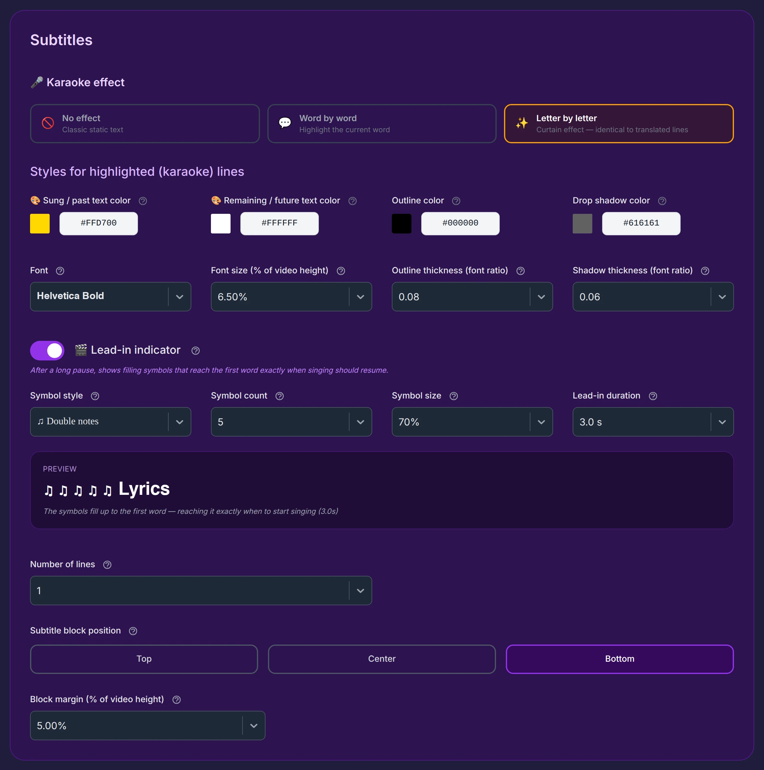
The karaoke effect
The very first choice decides how the text reacts while it's being sung. Three options:

- Letter by letter (default) — the real karaoke effect: the "sung" color sweeps across the line letter by letter, left to right, in perfect time with the voice, like a curtain drawing across the words. This is the effect of proper karaoke videos.
- Word by word — the whole current word changes color as it's sung. This is the social-media style (TikTok, Reels, Shorts), where each word pops as it's spoken.
- No effect — plain static text, with no color change: the line simply appears in its base color. Ideal for classic subtitles on a film, a documentary, or a personal video.
So the same tool does three jobs: karaoke, social-media captions, or ordinary subtitles — just by switching this one setting.
Extra settings for "Word by word"
When you pick Word by word, two extra controls appear, to make the current word stand out more:
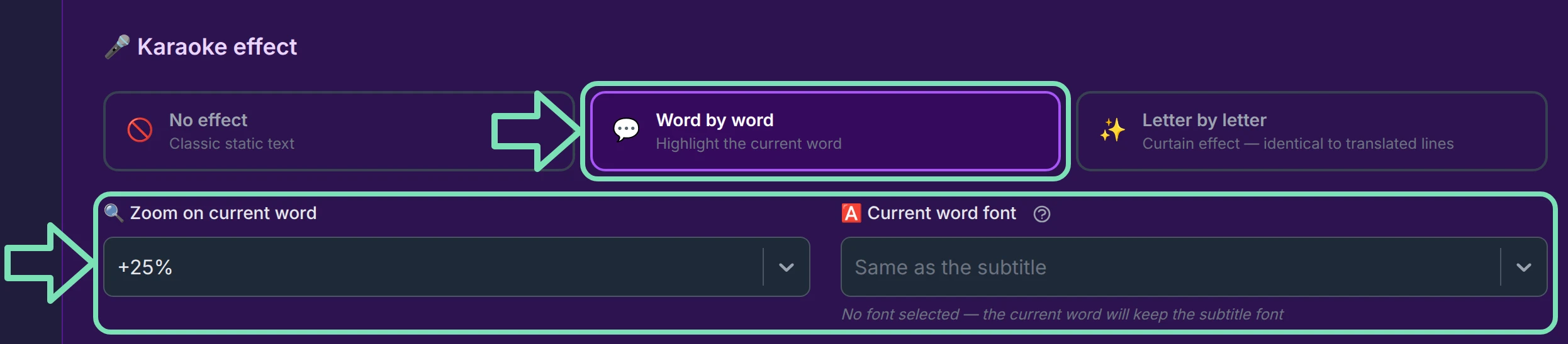
- Zoom on current word — briefly enlarges the word being sung. Options run from No zoom (100%) to XX-Large (+100%); the default is Medium (+25%).
- Current word font — give the current word its own font, different from the rest of the line. Left on Same as the subtitle by default, so the word keeps the line's font unless you choose otherwise.
Colors of the karaoke line
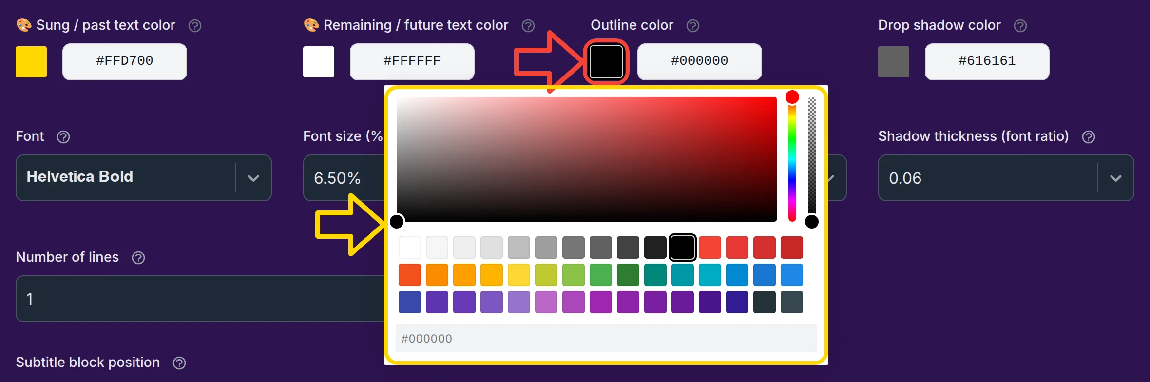
Four color pickers set the palette of the active line. Each opens a full picker with a transparency (alpha) slider and a hex field:

- Sung / past text color (default gold
#FFD700) — the color of the effect as it sweeps the line: the part already sung. In Word by word it's the color of the current word; in No effect it isn't used, and this picker is hidden (you then see only three colors). - Remaining / future text color (default white
#FFFFFF) — the line's base color, before the effect passes over it. At any moment you see two zones: the part already sung (the color above) and the part still to come (this one). In No effect, it's simply the text color. - Outline color (default black
#000000) — the thin border drawn around each letter, like a rim. It separates the text from the background so it stays readable on light, dark, or busy images. - Drop shadow color (default grey
#616161) — a soft shadow cast slightly behind the text, adding depth and lifting it off the background.
Both are on by default (a light black outline, a light grey shadow) for readability on any background. To remove either one, you have two ways: pick a transparent color (drop the alpha slider below 100%), or set its thickness to 0 in the size lists below.
Font and size of the karaoke line
Four lists shape the lettering. Every value is proportional, so your subtitles look right at any resolution.

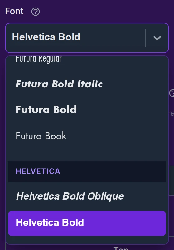
- Font (default Helvetica Bold) — a wide choice of typefaces, most of them chosen for being easy to read as subtitles (including Tiresias, designed for high legibility and low vision). Handy touch: in the dropdown, each name is written in its own font, so you preview the look before choosing. The list grows over time.
- Font size (% of video height) (default 6.50%, from 1% to 15%) — the size is a percentage of the video's height, not a fixed pixel value, so it keeps the same on-screen proportion whether your video is HD, Full HD, or 4K.
- Outline thickness (font ratio) (default 0.08, from 0 to 0.30) — how thick the outline is, as a fraction of the text size (0.08 = 8% of the letter height). Set it to 0 to remove the outline.
- Shadow thickness (font ratio) (default 0.06, from 0 to 0.20) — how far the shadow spreads, again as a fraction of text size. Set it to 0 to remove the shadow.
The lead-in indicator
When the singer pauses for several seconds — an instrumental intro, an interlude, a silence — it's hard to feel exactly when to come back in. The lead-in indicator solves that: a few seconds before the line resumes, a row of symbols fills up from left to right toward the first word. When the fill reaches the word, that's the moment to start singing. It also covers the very first line and long instrumental breaks.
It's off by default — flip the switch to turn it on and reveal its settings. Turning it on never changes anything on lines that don't have a long pause before them.

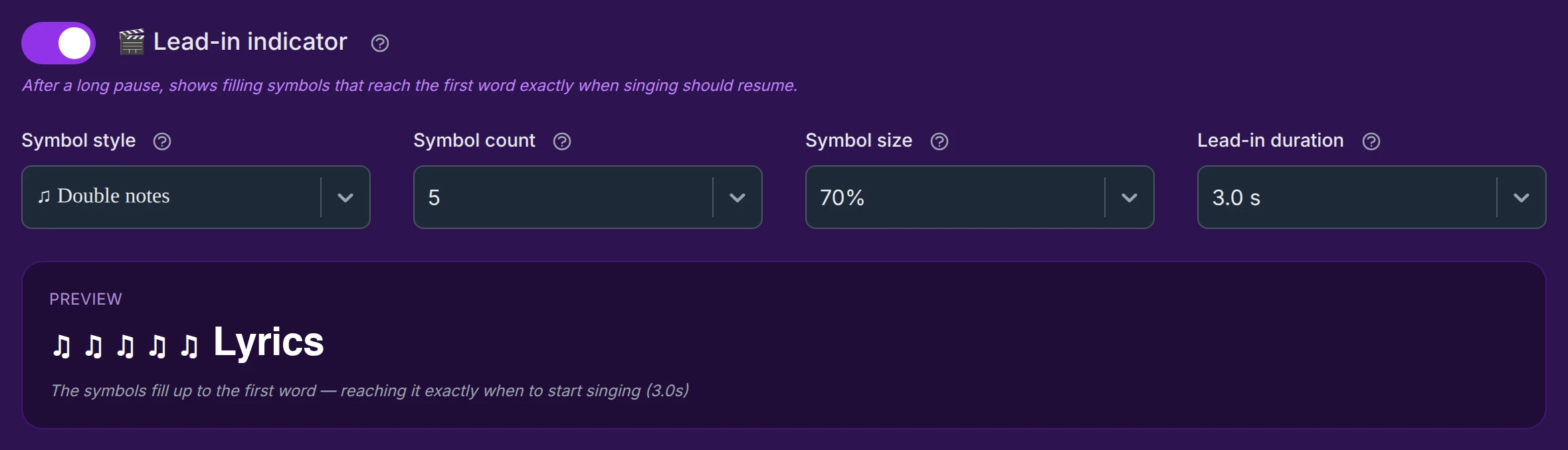
Four settings shape it:

- Symbol style (default Dots) — the shape of the filling symbols: dots, bullets, filled or hollow circles, music notes (single, double, beamed), triangles, chevrons, bars, or stars. Each is shown with its glyph in the list. The picture symbols use a built-in symbol font, so they always display correctly whatever subtitle font you chose — no missing-character boxes.
- Symbol count (default 5, from 2 to 8) — how many symbols appear before the word. More symbols give a finer countdown; fewer stay compact on long lines.
- Symbol size (default 70%, from 50% to 100%) — the size of the symbols relative to the karaoke font. Smaller symbols keep a long line from spilling onto two rows. It doesn't change the size of the lyrics.
- Lead-in duration (default 3.0 s, from 2.0 to 6.0 s) — how long the lead-in shows before the line starts. It only appears when the silence is long enough to show it in full, so it's never cut short.
A live preview below the settings plays the fill in a loop, at the chosen speed, and updates instantly as you change any setting — a quick way to judge the look before generating.
PREVIEW
The symbols fill up to the first word — reaching it exactly when to start singing (4.0s)
Number of lines

How many lines show at once in the block. 1 means only the karaoke line. Above 1, you add future (context) lines so the reader can anticipate what's coming — especially useful for singing along, where you read ahead.
You can go up to 8, but there's rarely any point beyond a few: 1 to 3 context lines are plenty in almost every case. It's impossible to follow the line you're singing and seven others at the same time.
As soon as you set more than one line, the interface reveals everything below — the static-line styles, the line spacing, and the fixed reading zone.
Styles for the static (context) lines
These settings appear only when Number of lines is above 1.
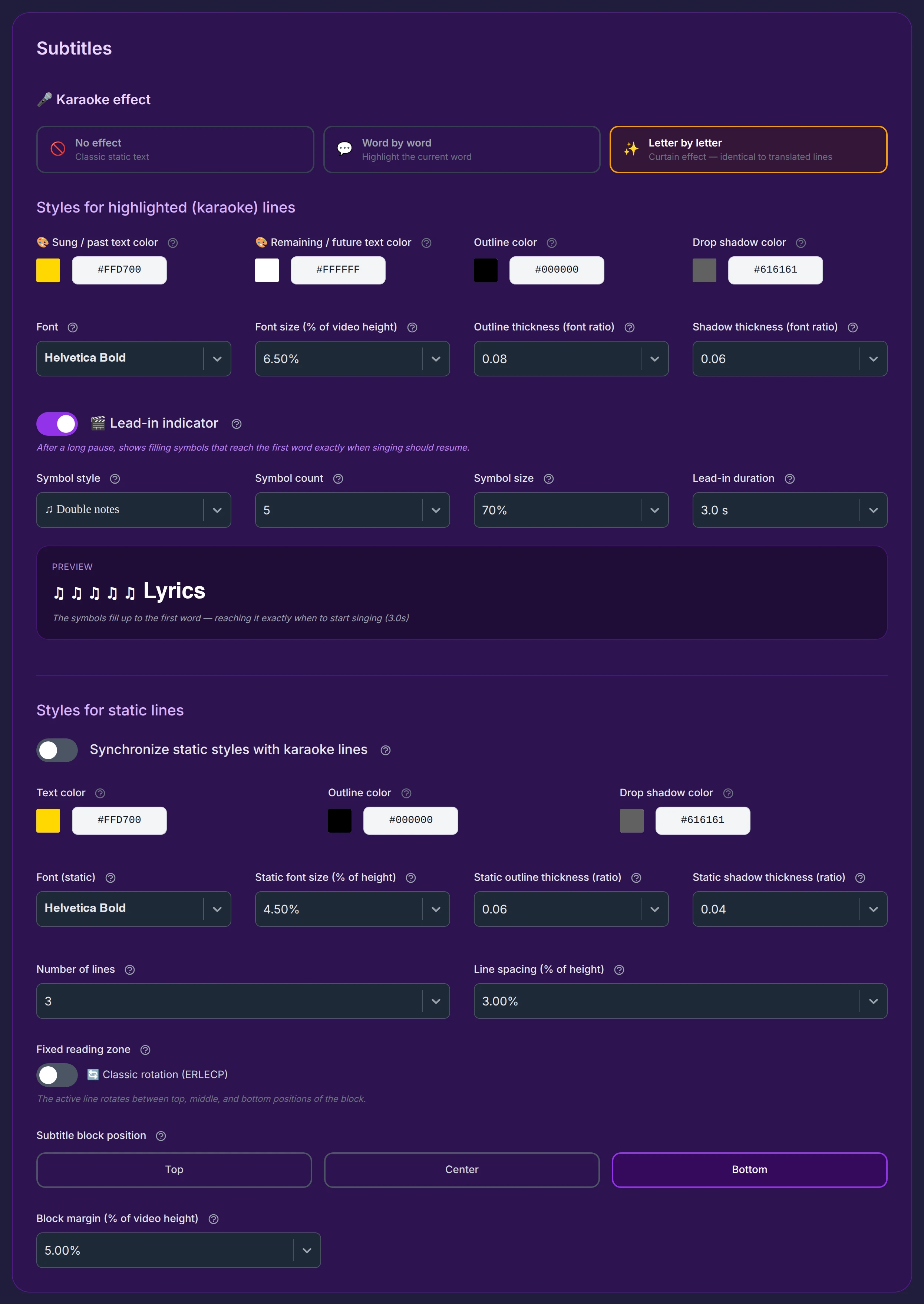
Match them to the karaoke line, or not
A switch, Synchronize static styles with karaoke lines, mirrors every karaoke style onto the context lines in real time:

- Leave it on and the context lines look exactly like the active line.
- Turn it on for a moment to copy the common styles in one go, then turn it off and adjust only the static settings you want different — so the context lines share part of the karaoke look but stand apart on the rest.
Colors, font and size of the static lines
Static lines carry no effect, so they have just three colors (no "sung" color). Their font and size lists work exactly like the karaoke ones above — same meaning, separate values:


By default the static lines are a little smaller than the active one (4.50% vs 6.50%) with slightly thinner outline and shadow, so the sung line stands out. Adjust any of them to taste — or use the switch above to keep them identical.
Line spacing

The vertical gap between two lines, as a percentage of the video height (default 3%). Larger values air the block out; negative values (down to −2%) pull the lines closer together to tighten a tall block.
The fixed reading zone (teleprompter)
With several lines on screen, you choose how the active line behaves as the song moves forward. A switch offers two modes:

- Classic rotation (default, switch off) — the active line moves through the block: each new sung line takes a different position, top then middle then bottom, in turn. Simple, but the sung line visually jumps from place to place, which some singers find distracting.

- Fixed singing zone (teleprompter) (switch on) — the active line is always anchored in the same spot (the lowest line of the block). Upcoming lyrics appear at the top and scroll down toward that fixed zone, like a teleprompter. The reading spot never moves — far more comfortable to follow. (A side-by-side video of the two modes will be in the FAQ.)
Where the block sits
Subtitle block position places the whole block at the Top, Center, or Bottom of the frame (default Bottom).

When a translation is also shown
If you display a translated line alongside the karaoke line, two blocks share the screen — so an anti-collision system locks the spot taken by one, to stop them from overlapping. The taken position shows a lock (🔒) and a note: "The Top position is reserved for the translation block."

Because each block guards its own spot, swapping positions happens one step at a time: first move the translation to a free position to release the spot you want, then move the subtitle block into it. (The translation line is set up in the Translation section.)
Block margin

The gap between the block and the edge of the frame, as a percentage of the video height (default 5%, from 0% to 20%). It's measured from the bottom edge when the block is at the bottom, and from the top edge when it's at the top.
When the block is centered, the margin is deliberately ignored — otherwise the block wouldn't be perfectly centered. So if this setting seems to "do nothing" in the Center position, that's expected.